
Friday, May 6, 2011
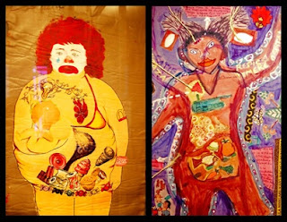
For the final project I want to address what I have gone through over the year. It is going a step further from addressing factual issues that I have discovered such as the deforestation. The more I learn the more I see all of the issues in our world and it overwhelms me. The most overwhelming part is what I can't do in regards to those issues. This is a small section of my drawing

Wednesday, April 27, 2011
Some awesome fun finds

By: Raul Perdomo
http://butdoesitfloat.com/681171/The-corrosive-effects-of-time-redefine-everything-against-our-will
Place: "Look What I Found!"

When I think of place my mind wonders into people. Trying to represent a person, as a place, was a little difficult for me to grasp so I went deeper. I started to think about all these places and people. Why are they important to me? Perspective was a word that kept surfacing during this question. I see these places and people different then another person. Then I took into consideration the how these places and people constantly change over time. In all of these thoughts unraveling I came up with and idea. I wanted to show as a kid we see things different compared to when we get older. As a kid I used to climb any branch I could reach, pick up any creature I could catch, and play anywhere could access. As I get older I no longer plop a seat on the ground without looking where I am sitting. I no longer climb trees in fear of falling, and I no longer pick up frogs snakes and salamanders for the joy of it.
How do I show a time? I simply took a picture of myself when I was at my carefree age and made myself holding a frog near my face in a gesture that says “Mom, look what I found!” I spent a long time trying to perfect the perspective of this drawing. I wanted the viewer to be looking down at the little girl who was in a window well. I am not trained enough in anatomy to create the form of the girl without looking at a picture and I could not find one. Instead I zoomed in on the girls face so that it is just neck and up with the frog by her face. I enjoy how the perspective turned out because it creates a sense of home video or photo taken by a parent who’s daughter just came to the door showing them what she just found.
Also, I find the facial expression, showing the girls joy, important for portraying my idea.
Materials were another personal debate for me. I thought of doing all paint but knowing that is not my strong media I wanted to mix in other materials. I did use a square canvas to get that viewfinder perspective I was looking for. In the past I have worked with newspaper and magazines to create an image, which intrigued me for this project. I laid down newspaper and magazine pieces as a foundation and help create the forms. I then added paint to the surface. Not completely pleased with how it turned out and being frustrated with he paint I turned to my safety net, colored charcoal. Another thing you will notice is the hair. I fringed magazine paper into small slits and used them as the bangs. I thought the hair was too flat and this would give it more texture. I am still not 100% clear if I like it or not.
I feel this piece is comparable to Sally Mann’s work. In Sally Mann’s earlier work she photographed her children. Though my subject has a different emotion represented then her children, both portray a sense of youth and innocence. Our perspectives in that sense may have been the only similarities. I use color a different emotion then Sally Mann. However, though I draw and she photographs, I feel as though my drawing reads as a moment captured in time randomly. Also like Mann, as it reads as a random moment we both premeditated what was going to be the product.
I think over all my approach on this project is fairly different then the artist we went over in class, other then what I mentioned above with Sally Mann and capturing a time. Majority of my influence for this project is combining styles I have used in the past and the web map we made in class. A lot of my process was digging deeper then the cliché surface ideas.
Over all I am please with my project. I do not think it is my best work however. I am continuing to explore different mediums and wish I could keep taking one project and reproaching it all semester. I think this piece could use some perspective adjustments in relation to the figure. As I mentioned before I am not a master at anatomy, and I should have spent more time addressing this. Also, when I first added the paint I did not want it to cover the paper I laid down before, but once the paint was down I could not get it off. I think a better way for that would have been to water down the acrylic paints before putting it onto the surface, so I could blend the two mediums together.
Thursday, March 31, 2011
Protest Project: "What's the Problem?"


The Walker Bill was a very influential part of the news that effected all of my classroom discussions. I do not have a solid argument for being against the act but to see it upset so many people and to cause such an up roar grabbed my ears. I attended the Chancellor’s presentation of the bill to the faculty and students. As informational as it was for me, I noticed a lot of the questions unanswered. If the question was answered it appeared to be not what people wanted to hear.
There were so many things in question that I wanted to capture more then one argument, which began the idea of an 8”x8” series of computer animated images. Initially I wanted to capture other perspectives including being for the bill, but I had a hard time wrapping my mind around an idea.
One of the shocking things that came up in the Chancellor’s meeting was the idea of Madison leaving the University of Wisconsin system. They question was whether this would affect the other universities considering Madison to be the biggest and most well known of the system. My first piece I took a building from each UW school and stacked them above Madison’s building at the bottom. There are two stick figures pushing and pulling Madison in the same direction. The government is the man pushing, and the people of Madison represent the one pulling.
My second drawing is good old Governor Scott Walker himself. My initial plan was to have him saying something contradicting to himself, but I didn’t want the words to consume my piece and I could not think of something good enough for my satisfaction. It turns out the empty word bubble work. There are not answers to these people’s questions.
My third piece is addressing a couple ideas. In class we watched the video where a state representative called the protesters and state workers pigs. There was also a concern at the Chancellor’s meeting about losing retirement and losing large segments of their checks. I drew a piggy bank with money going in and two stick men taking money from the bottom. This is to represent the taking of money earned.
There were some other ideas that I did not get a chance to incorporate. One issue talked about was classroom sizes. I was going to take an 8”x8” spread and smash a bunch of sketched kids into the square with a classroom number at the bottom. For one of my ideas from the other perspective, I was going to draw a bunch of state workers portrayed as animals being lazy.
My ideas seemed to be direct representations of concerns and what is happening. It has a satirical feeling and is simplistic drawings with minimal color. I wanted minimal color because I wanted the three pieces to be cohesive and maintain a cartoon style.
Nancy Spero was a person who stuck out in the presentations in class. With out any intentional plan, I feel that my piece can be relatable to her art. She uses these solid simple forms. Though hers appear to be in a more abstract context, they both tell a story. Her soft colors also reflect the color choices I used in my protest pieces. Both our works also extenuate bold solid lines creating forms, yet her pieces flow more as on as mine has a stronger contrast with the background.
Andrea Bowers is another artist we spoke about briefly in class that seems to share some quality in her artwork with my protest piece. Her artwork has strong black and white contrast with the background, which I find my pieces also have. Also, Andrea Bowers uses minimal color that I also tried to accomplish. I get very nervous when applying color, especially to a black and white outline. I’m scared to lose that strong sharp relationship between the subject and the background that I find appealing. I find it easier to read the subject and to appear to be very confident.
As thrilled as I am for the individual pieces, I am not completely satisfied as a whole. I do not feel as though I have captured enough of the ideas, and perspective I initially tried for. I feel as though the three drawings alone to not speak of this problem I was trying to get across. I wanted people to be overwhelmed with the contrasting ideas and shocking concerns and possibilities Walker’s Bill has struck up, because that was the feeling I was experiencing as this issue unraveled. I want to continue to ad to this project and hopefully I can get to that final emotion I was shooting for.
Thursday, March 10, 2011
My thoughts on the Walker Bill...
Like I said in my last post. I am not well educated in the sense of politics. I am glad we are doing a protest piece especially on a topic that does effect me directly. I'm sad that it took this project for me to take an interested in the Bill. Yesterday afternoon I attended the Chancellors discussion with faculty on the matter. There were many questions and many negative answers. From the conservative side I hear a lot of points about unions costing the state a lot of money. Listening to this discussion allowed me to see both sides of this argument and how it is going to effect, not just state workers, but also my education. I am still have loads of questions as I am sure a lot of other people do. Instead of taking a side with my piece I want to focus on the different views and different arguments for and against the bill. I want to make it satirical because I enjoyed that part on my last project. I can already see my ideas narrowing in on being "against" the bill but I am going to "try" and come up with ideas for the other side. We'll see how they turn out.
Thursday, March 3, 2011
Scott Walker's failure to look into the future
What does America have that people want? Freedom. What gives people the opportunity for a brighter future? Education. I find it heart breaking that when a state needs budget control, education is the first to go. Scott Walker is not the only politician to neglect education. I grew up in Minnesota and a lot of what I heard about during elections growing up was about budget cuts to public schools. I hate to mention my sustainability class once again, but it has taught me something that I find important in thinking of anything. It taught me to look into the future. What is taking money from education really going to do in the future? Sure, it is a quick fix solution to the budget issue at hand. However, does that really justify belittling the peoples education. We all pay taxes. I pay taxes gladly blindly knowing they are going towards things the state provides me with. I say blindly because it is what I am told and I do not physically see where my money is going. Hopefully it is going towards things like, roads, education, health, and protection. I do not pay taxes so that these rich, "daddy's money" senators and politicians can drive the brand new car, so that they can eat out at high class restaurants, and have multi-million dollar homes with a lake house. Then to have them vote on taking more money from us (our education) so they can keep these things and fix the budget. I guess I do not know exactly how much a senator or congressman makes. It would be interesting to see how much they make in a year compared to their hours, next to a teachers pay check. As far as Wisconsin's education, and going to a public college, I feel as though I am learning every day. I have never felt cheated out of my money except the occasional movie day or teacher sick day. Does taking money away really make teachers work harder? "Lets piss off the people who give us a chance to make a living so we learn nothing and feed into a vicious cycle of poor education". Sounds great to me. Teachers do not get into teaching to make money. They do it because they care about it. If society was truelly given a far chance at education it would create a much more intense competition in the work world. What if everyone was given the perfect education? What would welfare be life? Would we have an issue with Health care as much?
This is me talking, and I will admit I am not well educated in the sense of politics and how they work. I even accidentally called Scott Walker, Paul Walker in this post. This is just how I feel with what we have been talking about in class.
This is me talking, and I will admit I am not well educated in the sense of politics and how they work. I even accidentally called Scott Walker, Paul Walker in this post. This is just how I feel with what we have been talking about in class.
Monday, February 28, 2011
"enthocentric" Westerners
Today in Cultural Anthropology we talked about how western societies created this idea that their (our) culture is superior to the so called "barbaric indigenous peoples". In 1993, two traveling performers, Guillermo Gómez -Peña and Coco Fusco, dressed in foreign clothes go to art museum to art museum acting as thought they are newly discovered savages off the coast of Mexico. This was meant as a Satirical art performance directed by Paula Heredia and Coco Fusco. It was shocking to see that some of the audience members actually responded as if they were actually from this island off the coast of Mexico and they were really being held captive for display. I thought this relative to our recent project in the sense of criticism of an idea. This art piece was meant as criticism to this western idea that we are superior to other countries and people that do not live the way we do.
http://www.youtube.com/watch?v=gLX2Lk2tdcw
I could not find the actual video but this is a clip that gives a little more a visual then I talked about.
http://www.youtube.com/watch?v=gLX2Lk2tdcw
I could not find the actual video but this is a clip that gives a little more a visual then I talked about.
Saturday, February 26, 2011
Getting there...

Mapping Project:
“Murder of Many”
By: Heather Behrendt
2/22/2011
For the past five weeks I have been continuously reading of the continuing and growing destruction of the world. Most people would think economical or human destruction. Maybe even aliens taking over, but isn’t that what humans are doing? We waltz into any creatures’ home and take what we want. We have created this idea of superiority to nature when we really are a part of nature. Once we began to discuss mapping in class my ideas started to roll. They were rocky at first but began to turn into a political concept portraying the United States taking over the world. This may be the political side of the world but what about the world including all its factors. Natural vegetation is losing. I searched on Google for maps that distinguished what areas of the world contained lost forestry. I was shocked to see the results. Almost all of Canada, Japan, Europe, and Madagascar were completely destroyed. Large spots in the Middle East, Center of South America were missing, and the only large forest in Africa seemed to strategically being attacked surrounding its perimeters. The brown spots representing the lost forests gave me an idea. I wanted to draw a rough map of the world and burn holes in the spots that represented those lost forests. I think it is a strong statement and representational way of getting my point across. They are simply gone. How would this be presented was my next issue to tackle. I could not just simply hang this on the wall because it would lesson the effect of the wholes. I came up with the idea of mounting the art piece between two boards of plexiglass to allow the strong absence of the spots from the paper. This ideology that we can fix anything is not truth. We are advanced creatures but as of now there is now technology that can replenish the world of it nature resources at the rate we are taking them. I want to expose more then just a simple map with wholes. I want to use black ink sketches to poke fun of this idea of forestation target at people. I began to think of surrounding the map with cartoon drawings of human forces destroying the world in fantasized ways.
I can’t compare my artwork in a similar mirrored idea to any of the artist we talked about, but I did involve subtle ideas into my piece. I enjoyed Julie Menretu’s idea of no conclusion, but the complete abstract way of creating this idea seemed difficult for me. It did strike a thought; this idea of deforestation is not yet concluded in reality so how could I portray such an idea. I also enjoyed her bold mark making with the shapes. I had been seeing charts representing the growth of deforestation shown with a bright red jagged line; what a great incorporation that used a bold mark. How could I show this as inconclusive? I then thought of the idea of people keep taking. What happens when the two ideas meet? That is where the second line was invented. The first line represents the amount of forest existing and the second line represents how much forests humans are destroying. They do not quit meet but it is intriguing to thin of what would happen if they did. Arshile Gorky also caught my eye, but yet again my artwork was not completely influenced by such a style. His art is a step towards representational from Menretu’s but not quite a leap. His bold choice in colors and little white space is what I was focused on. I did not want to leave the blank spaces of the world blank. I enjoyed the bright colors of maps and the arbitrary lines. I decided to take those maps and make them the blank spots of my world. Also, I decided to make the water blue, and the tree areas green. I know that it seems uncreative and far from unique, but I am trying to represent something and my decision has a deeper meaning then those destination maps. Then it occurred to me; how is the water being destroyed? Well recently the big news was the oil spill. How often does this happen? I left it to Google to show me a map of the history of oil spills and so began the blank ink spots.
Though my artwork did not completely inhabit the idea of abstract, it represents something strong I feel. I think its weakness is it’s simple and close to accurate appearance of the world. I think it is a fare concept to point out as a fault. I think the next weakness is its materials. I think I like the materials I used but since some were new to me, I wish I played with them a bit before incorporating them. They seem to mesh just not in the right spots. In all honesty I am not 100% happy with this project. I think mostly because it is far from what I normally do. Also, I feel the water I applied extremely too strong. It is overwhelming to the piece. I would love to take another crack at this idea and be better at meshing the materials together and making it seem more cohesive.
Questions:
1. Do you find the representation of the world too common?
2. Do you feel that the cartoons are too much? Too big?
3. What areas to you think is weak in relation to cohesiveness?
4. Do you think the burning is an effective strong representation?
I am not entirely satisfied with this piece but I am enjoying where it is going. I am going to continuing working on it more and come up with a better way of displaying it for the best effect. Also, I did not mention an artist above who I seemed to connect with through this piece. I have always enjoyed Andy Ducett's play with sketched outlines with a cartoon feeling. My characters I had added in this piece definitely are comparable to his art work; maybe not accuracy of drawing but I think style wise. This is also a terrible picture. Once I am done I'll post this again.
Tuesday, February 15, 2011
Mapping
I was having issues creating my second post so I wrote it down to post when I figured the problem out.
Real Post Date: 2 / 11 / 2011
The whole concept of creating a map as art was strange to me and seemed a bit cliche at first. Then, after we watched the video of Julie Mehretu, it became more clear to me. Before the beginning of this week my ideas for this project were leaning towards cliche. My first idea was to recreate my childhood neighborhood with my memories as landmarks and in a cartoon childish manner. Other then this, the rest of my ideas involved portraying the USA as the bully of the world. I am not one to bash my own country or have considerable hatred towards it, but it does seem to be a well known idea that is controversial. My sketch of Uncle Sam swallowing the world made me think of mankind as a whole destroying the world. I am in a sustainable design course which I find affecting the way I think and approach certain things. After the beginning of this week I began to think deeper. Deforestation has been effecting the world since mankind began domesticating animals and since the invention of agriculture. It has been a snowball effect. People continued to keep destroying more and more of the forests with giving little to nothing back. It has become more aware to us as we become more educated about the world. However it is not something that is a high priority of the world yet it is one of the most important. In my piece I want to capture the history, effects, and physical impact on the world deforestation has had. I enjoy mixed media and want to continue exploring the materials I could use. I love using ink because of the limited control and the unique bold markings that come from it. I also love the feel of maps with the bold solid lines that seem to mean something important and supposedly are accurate. I plan on somehow incorporating these aspects strongly into my project. I also enjoyed the Question related to an art piece not having an ending or conclusion. This is going to be something I want to take into consideration. It creates a nice concept for the artist and the viewer. The artist is given the opportunity to put down personal things but not so others are able to know what it is. It is if you are writing in code that you only know how to decipher. It also creates a mystery intriguing viewers and allowing them to interpret the piece in a way that relates to them. My most recent idea is to create a piece representing the deforestation of the world. I am not entirely sure how I am going to create something without an end or conclusion, but I want it to come off progressively but never reaching climax. I want it to make people think what will happen if it continues and hopefully they are thinking of only negative conclusions. It is funny because we talked about Utopia at the very beginning All but one of my ideas is contrasting to such an idea. I guess it is easy for me to think negative about the world, yet I never find myself saying I do not like my life. I think it is because I do not know what I want out of life but I know what things I want to change. As a more difficult exploration of mapping, I could challenge myself to get to understand what my utopia would be.
Here are some mapping examples that caught my eye browsing for ideas...
 By Students at Don Mills Collegiate Institute
This picture I thought was a unique way of using mapping, the anatomy, and also contrasting two different mappings.
 Taken in Stockholm. Photo By: Nicholas Claude
This would be my favorite picture I came across. It appears so simple and effortless and it brings into the childhood feeling that I explored in my mind. The red markings also makes me thing of the children book about the little boy and his magic crayon that brings things to life.
Real Post Date: 2 / 11 / 2011
The whole concept of creating a map as art was strange to me and seemed a bit cliche at first. Then, after we watched the video of Julie Mehretu, it became more clear to me. Before the beginning of this week my ideas for this project were leaning towards cliche. My first idea was to recreate my childhood neighborhood with my memories as landmarks and in a cartoon childish manner. Other then this, the rest of my ideas involved portraying the USA as the bully of the world. I am not one to bash my own country or have considerable hatred towards it, but it does seem to be a well known idea that is controversial. My sketch of Uncle Sam swallowing the world made me think of mankind as a whole destroying the world. I am in a sustainable design course which I find affecting the way I think and approach certain things. After the beginning of this week I began to think deeper. Deforestation has been effecting the world since mankind began domesticating animals and since the invention of agriculture. It has been a snowball effect. People continued to keep destroying more and more of the forests with giving little to nothing back. It has become more aware to us as we become more educated about the world. However it is not something that is a high priority of the world yet it is one of the most important. In my piece I want to capture the history, effects, and physical impact on the world deforestation has had. I enjoy mixed media and want to continue exploring the materials I could use. I love using ink because of the limited control and the unique bold markings that come from it. I also love the feel of maps with the bold solid lines that seem to mean something important and supposedly are accurate. I plan on somehow incorporating these aspects strongly into my project. I also enjoyed the Question related to an art piece not having an ending or conclusion. This is going to be something I want to take into consideration. It creates a nice concept for the artist and the viewer. The artist is given the opportunity to put down personal things but not so others are able to know what it is. It is if you are writing in code that you only know how to decipher. It also creates a mystery intriguing viewers and allowing them to interpret the piece in a way that relates to them. My most recent idea is to create a piece representing the deforestation of the world. I am not entirely sure how I am going to create something without an end or conclusion, but I want it to come off progressively but never reaching climax. I want it to make people think what will happen if it continues and hopefully they are thinking of only negative conclusions. It is funny because we talked about Utopia at the very beginning All but one of my ideas is contrasting to such an idea. I guess it is easy for me to think negative about the world, yet I never find myself saying I do not like my life. I think it is because I do not know what I want out of life but I know what things I want to change. As a more difficult exploration of mapping, I could challenge myself to get to understand what my utopia would be.
Here are some mapping examples that caught my eye browsing for ideas...

This picture I thought was a unique way of using mapping, the anatomy, and also contrasting two different mappings.
 I
I By Benjamin Edwards
This one caught my eye because of the bold colors and bold lines. Also the digital feel alone gives the mapping sense to this picture.

This would be my favorite picture I came across. It appears so simple and effortless and it brings into the childhood feeling that I explored in my mind. The red markings also makes me thing of the children book about the little boy and his magic crayon that brings things to life.
Wednesday, January 26, 2011
My Introduction

Hello, my name is Heather Behrendt. Like all the fellow students that are pursuing an education in art, I was always told I was a fantastic artist. I spent my school days doodling and striving to be like my grandpa. Though my grandpa is not a professional artist, he has and still is active in creating pieces for his own home decor or as a presents for family and friends. He paints classical landscapes and gardens, which I believe is where obtained the taste for detail and realism. I have always been reserved about my art, like most of us as we discussed in class. This caused me to stray from art in my middle school days. For high school I attended Hill-Murray. For those of you who don't know, it is a private catholic school, and one of the most important decisions I made in life so far. During my required art class the teacher encourage me to pursue art as a career. I told her I wanted to be an architect not realizing that the two could go hand and hand. From then on I concentrated on getting into an art school which brought me here, to UW-Stout. Since my first day, now halfway done with my sophomore year, I have played with many different ways of shaping my education. I am in the process of switching from art studios into interior design and I have just been accepted into the sustainable design minor. With this, my most recent plan is to renovate homes and save the environment one leap at a time. Though two months prior I was convinced I was going to be a botanist, so it is not set in stone.

 The picture about is my final for drawing I. The assignment was to address the mid line of the dip-dick and I used it as a chance to attempt using my realistic approach and trying out the abstract style. We also had to come up with a story line. Unfortunately mine ended up being cliche as the girl is struggling with her brother having a substance abuse. There are things I would change about this piece but I think it shows my struggle with abstract.
 One thing I love about art is exploring new mediums. I find it completely challenging but refreshing creating art from nontraditional materials. The original image of the piece about was of a homeless guy and man's best friend. We had to take the photo and recreate it using pieces of black and white paper. I used all newspaper, more specifically the Stoutonia. I am excited for drawing III and look forward to the challenges to come!
Subscribe to:
Posts (Atom)